DURATION
5-weeks and product lifecycle were 5 weeks
January - March 2024.
MY ROLE
Designed, published, and maintained the website and oversaw campaign literature production. Led the campaign's strategy, branding, and marketing efforts collaboratively.
TOOLS
Pen & Paper, Figma, Wix.com, Snip & Sketch, Google Meet, Google Docs, Zoom, Claude.AI, & Vistaprint.com
Key Results
Increased Name Recognition: Achieved a 97% increase in candidate name recognition by election day.
Financial Success: Covered 96% of campaign expenses through website donations.
Volunteer Recruitment: Recruited 28 volunteers via the website.
Election Victory: Secured a City Council seat with 55% of the vote against two established opponents.
Introduction
Mike Scanlan, a first-time political candidate for South Burlington, VT City Council, faced an uphill battle against two established opponents. With no prior social media presence and limited name recognition as new resident, the client needed a robust digital strategy to connect with voters and share his vision effectively.
Problems
Extreme time constraints -only two days to launch the website and two weeks for the entire campaign rollout.
Solutions
Rapid Sketching and Mapping: Utilized sketching and modified affinity mapping techniques to rapidly explore layout ideas, information architecture, and user flows.
Leveraging Pre-built Solutions: Selected a responsive template on the Wix platform, ensuring alignment with the defined branding and information architecture to facilitate quick development.
Iterative Development: Launched the website rapidly, implementing continuous testing and iteration based on user feedback and analytics to enhance performance over time.
Tight budget with unpredictable donations.
Dual-option Donation System: Integrated PayPal's donations alongside traditional check payments, catering to tech-savvy supporters and those preferring traditional methods.
Strategic Website Design: Strategized website design as a campaign's central hub, effectively showcasing the candidate's bio and vision with compelling calls to action for donations.
Cost-effective Print Materials: Designed cost-effective print materials, including eye-catching newspaper columns, postcards, door hangers, and personal letters, to complement campaign efforts and reduce expenses.
Lack of Candidates Name Recognition.
Strong Personal Branding: Created a cohesive visual identity for personal branding, enabling quick connections with voters and leaving a lasting positive impression.
Multi-channel Approach: Complemented digital efforts with print materials to increase visibility and reach voters through multiple touchpoints.
SEO Optimization: Focused on optimizing the website for search engines to improve online visibility.
Outcome
Despite the challenges, the digital campaign led to a victory with 55% of the vote over well-known opponents in the community. As the Product Designer, I developed and launched a campaign website that encouraged volunteer sign-ups, catalyzed steady donations, and motivated voters to cast their ballots for Mike Scanlan. This cascading, impactful online presence contributed to the candidate's victory in the City Council election.
Week 1-2: Analyze, Ideate, Design & Launch
1. Research
The research phase for the campaign included two main components:
Interviews with former city council candidates and a heuristic evaluation of competitors.
Interviews with Former Candidates
I interviewed three former city council candidates to gather insights on citizen behavior, expectations, and essential campaign elements. Key findings identified critical components for a successful campaign:
-
Well-planned budget
-
Strong volunteer base
-
Cohesive brand identity
-
Widespread name recognition
-
Comprehensive platform that resonates with voters
These insights clarified the campaign's needs, highlighting the importance of budget management, volunteer recruitment, and establishing the candidate's name recognition through a strong personal brand identity.
Competitor Analysis
Competitor - 1
-
Experienced with three prior campaigns
-
Strong supporter base
-
Focused on personal outreach and mass media
-
Recognized for leadership in supporting underserved communities
Competitor - 2
-
First-time candidate
-
Known for land preservation efforts and analytical mindset
-
Utilized social media (Facebook, LinkedIn, Instagram) for campaign outreach
Impact on Design Decisions
The research findings significantly shaped our design strategy:
-
Brand Identity: We developed a distinctive visual style for all campaign materials.
-
Multi-channel Approach: The website served as a strategic hub, transforming print materials into a digital engagement gateway that amplified name recognition and voter connections.
-
Targeted Messaging: Insights from the platform informed visuals and messages that resonated with diverse voter demographics.
-
Widespread name recognition
-
Competitive Edge: Competitor analysis guided our differentiation strategy in both visual identity and messaging.
2. Personal Branding & Yard Sign Design
Results: In the first six hours of the campaign, I created a strong yet minimalistic personal branding strategy for the candidate, using the yard sign as a visual springboard. By ensuring a cohesive visual identity, voters could quickly connect with and remember the candidate's message. This approach saved time and reinforced the campaign's themes, leaving a lasting impression on the electorate.
Why? From the research phase, I recognized that defining the candidate's personal branding from the outset was essential for creating a cohesive and impactful visual identity across all campaign materials. Since yard signs take about two weeks to produce, prioritizing them helped build name recognition for the candidate right from the beginning. This decision also gave our team a tangible design element to discuss in early meetings, allowing us to refine our ideas effectively.

Creative techniques
were employed
The yard sign design conveyed energy, trust, and commitment to change. It featured bold, contrasting colors and a large, simple font that ensured maximum visibility and easy readability from a long distance, particularly for drivers.
Color Psychology
I strategically chose three primary colors to support the client's message: blue for trust, orange for energy, and white for clarity. This carefully curated high-contrast color mix significantly reinforced the campaign's values and appealed to voters.
Typography
I explored various font combinations and styles to ensure the text remained accessible, even when viewed from a moving car. The chosen fonts—Verdana and Montserrat—convey professionalism and trustworthiness, emphasizing readability. The typography design achieved a high contrast ratio, surpassing WCAG AA and AAA standards for normal and large text, graphical objects, and user interface components. This contrast ensures optimal legibility across various viewing conditions.
Symbolism
I designed a checkmark logo to represent progress, good choices, and a call to vote. I also added an orange wave symbol to show movement, change, and energy, highlighting the candidate's dedication to progress and community involvement.
3. Website Sketches & Mapping
Results: Given the tight two-day deadline for launching the website, I utilized sketching and modified affinity mapping techniques to rapidly explore layout ideas, information architecture, and user flows. This approach facilitated effective collaboration and feedback with the candidate and small campaign team. Additionally, I quickly interviewed five potential users to gather insights on their needs from the website. These combined efforts ultimately led to the following:
-
A comprehensive site map.
-
Identification of the most important pages and optimal information architecture.
-
SEO optimization for improved online visibility.
-
User-centric design based on voters' feedback and preferences.
Why? This approach leads to the design decision that the candidate's website can work as the central hub of the campaign.

Approach: Through hand-drawn sketches, I mapped out essential website components, such as the candidate's bio, campaign promises, donation functionality, and content hierarchy. These sketches facilitated effective collaboration and communication with the candidate and team, enabling quick feedback and revisions before moving into the production phase.
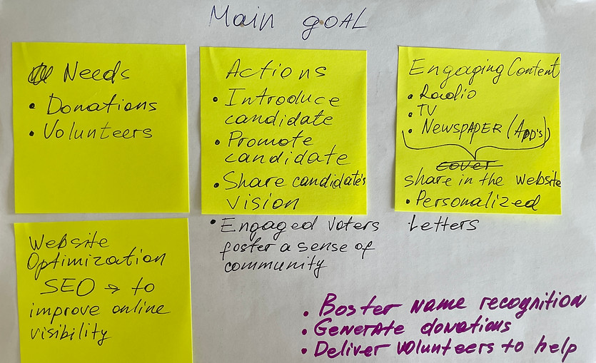
Campaign main needs
Boost name recognition
Familiarize voters with the candidate, as the client had moved the city only 18 months ago. Strong name recognition helped build awareness and trust within the community.
Deliver volunteers to help
Cultivate a sense of community and shared purpose to inspire volunteers to write letters of support to the newspaper, put up yard signs, and distribute door hangers.
Generate donations
Highlight his policy positions to encourage financial contributions from supporters who shared the candidate's vision.
Voters' main needs
1
Clear Candidate Information - offer accessible details about the candidate's background, qualifications, and key policy positions.
I want to understand the candidate's background and how his plans will make my life better.
2
Engagement and Communication - provide multiple ways for voters to connect with the candidate and stay informed about the campaign.
I want to reach out to the candidate and ask questions easily, and I want updates.
4. Website Design & Launch
Results: The website became the campaign's central hub. It effectively showcased the candidate's bio, vision, and promises, with compelling calls to action for donations and volunteer sign-ups. I then added mobile optimization, which expanded the pull of potential users, i.e., voters, and an insured responsive design across all devices.
Why? With the branding and wireframes in place, developing the website became the top priority to quickly establish a solid online presence for the campaign.
Approach: Leveraging the Wix platform, I chose a responsive template aligned with the defined branding and information architecture. I meticulously crafted each page, ensuring a visually appealing and user-friendly experience across all devices. Optimizing the website for search engines was a key focus.
Mistake: By launching the website quickly, I initially overlooked mobile optimization. This became evident when three potential users scanned the QR code during a test session and struggled to navigate the site on their phones. As a result, mobile users faced challenges that could reduce user engagement, candidate name recognition, and donations.
Mobile-friendly design
After implementing a mobile-friendly design within 24 hours of receiving feedback, I closely monitored the website's performance for the next 48 hours. This period was crucial for assessing the impact of our swift mobile optimization efforts.
Key Observation:
-
Increased Mobile Traffic: There is a significant uptick in mobile users accessing the site.
-
Improved Engagement: Longer mobile session durations indicated better user experience.
-
Higher Conversion Rate: More mobile users completed desired actions (donations, volunteer sign-ups).
24-Hour after implementation of mobile-friendly website - Sessions by Device Data
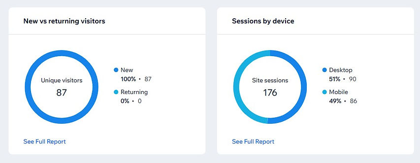
48-Hour after implementation of mobile-friendly website - Sessions by Device Data

Donation Payment Section
Results:
-
96% of campaign expenses were covered through website donations.
-
Seamless donation reporting for the client facilitated compliance with legal reporting requirements.
-
73% of donors preferred PayPal over paper checks, indicating a strong preference for the web page’s donation option.
-
Check payments tended to be larger, showcasing the value of maintaining both options.
The dual-option approach significantly improved the campaign's financial situation.
At the start of the campaign, voter donations were crucial due to the limited initial budget.
I implemented a dual-option donation system, integrating PayPal's "Contribute" button alongside traditional check payments via mail. Wix.com's SAAS capabilities allowed me to cater to tech-savvy supporters who prefer online transactions and the more traditional audience who prefer writing checks.
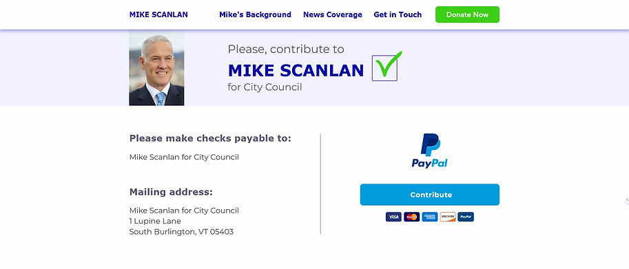

Approach:
-
Analyzed campaign analytics showing traditional reliance on check donations.
-
Recognized the need for a more convenient online donation option.
-
Considered the need for easy donation tracking for reporting purposes to the State election office.
-
Evaluated Wix.com platform limitations.
-
Added PayPal's "Contribute" button as an alternative to the check donation option.
This strategic decision to offer multiple donation methods proved highly effective despite time pressures and platform limitations. It demonstrated the importance of understanding donor preferences and leveraging technology to facilitate donor contributions.
Volunteer Recruitment and Engagement Section
Results: 28 volunteers were successfully recruited via the website's "Volunteer to Help" section to carry out the campaign's outreach efforts. In total, 157 e-mails were received from potential voters, volunteers, and donors via the "Get in touch section."
1. General Call to Action: Initially, a broad appeal for volunteers was placed on the site, allowing supporters to express their interest in helping.
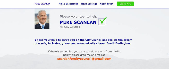
2. Specific Task Squares: After five days, I added five squares with specific tasks volunteers could assist with, providing clear direction for potential helpers and alleviating the candidate's need to explain roles to each prospective volunteer.

3. "Get in Touch" Section: strategically pleased as footer of every page. This multi-functional element served several purposes:
-
Provide a channel for communication
-
Volunteer Recruitment
-
Donation Facilitation
-
Voter-Generated Content

This approach streamlined volunteer recruitment and established a direct dialogue between the candidate and the voters, enhancing engagement and providing valuable insights for the campaign strategy. The footer's consistent presence across all pages ensured maximum visibility and accessibility for user interaction.
Week 3-5: Testing, Iteration & Printing
1. Website Testing & Iteration
Results: I improved the website's user experience and engagement through continuous testing and iteration. User feedback revealed that the homepage needed to be shorter, as users were not scrolling down to view the candidate's background, which was one of his key selling points. To address this, I added a "Background" menu item to the homepage navigation menu, effectively separating the candidate's vision from his background. This allowed me to shorten the homepage while facilitating more straightforward access to key information. As a result, navigation was enhanced, and engagement with the "Get in Touch" section increased. Overall, the website remained dynamic and responsive to campaign needs, maximizing its effectiveness as a conversion tool.
Why? Continuous testing and iteration based on user feedback, analytics, and campaign progress were crucial to optimizing the website's performance and adapting strategies as needed.
Approach: I regularly reviewed website analytics, user feedback, and campaign metrics to identify areas for improvement. This data-driven approach guided iterative updates to content, design elements, and calls to action. Additionally, I adjusted distribution strategies and messaging based on voter engagement and donation patterns.
Donation Payment Section
Website analytics and user feedback revealed that the “Homepage” was too long. Users often left after reading the candidate's vision without scrolling to the end. Four users specifically mentioned difficulty finding information about the candidate's background.
I appreciate the candidate's vision, but I need more information about Mike's background so that I can feel informed and confident.
I initially placed the candidate's background at the bottom of the homepage.
Website Optimization & User Engagement
-
Added a "Background" menu item to the homepage navigation menu, improving access to the candidate's experience and qualifications.
-
Separated the candidate's vision from his background information to make it easier for users to find relevant information quickly.
-
Shortened the homepage to enhance accessibility of the "Get in Touch" footer section.
_JPG.jpg)
These changes resulted in three significant benefits:
-
Improved visibility of the candidate's vision on the homepage
-
Add clarity to the candidate's background
-
Increased user engagement with the "Get in Touch" section due to improved accessibility.
The impact of these changes became evident through the Wix Analytics Traffic Overview data, particularly on election day. The website played a crucial role in the campaign, with traffic patterns revealing:
-
There was a significant spike in visitor activity on voting day, as voters accessed the website for last-minute information before making decisions.
-
A higher proportion of new visitors and mobile users on election day.
-
Longer average session durations, indicating in-depth exploration of the candidate's positions.
Significant spike in visitor activity on voting day (March 5)
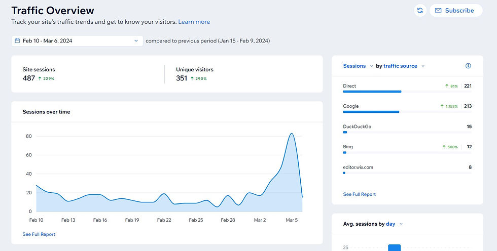
The website's role as a crucial information source for voters was highlighted, especially in the campaign's final hours. The earlier optimizations made to the site proved invaluable during the election day surge, influencing last-minute voter decisions and significantly contributing to the campaign's success. These enhancements demonstrated the effectiveness of the digital strategy in supporting the candidate's victory.
2. Print Materials Design & Distribution
Results: The print materials effectively reinforced the candidate's brand, directed voters to the website for more information, and facilitated engagement through QR codes and clear calls to action.
Why? Complementing digital efforts with print materials was crucial for increasing visibility, reaching voters directly, and driving traffic to the candidate's website. This multi-channel approach ensured broader reach and reinforced the campaign message across different mediums.
Approach: I designed eye-catching newspaper columns, postcards, door hangers, and personal letters, maintaining a consistent brand identity across all materials. Strategic distribution plans targeted key neighborhoods and high-traffic areas. Newspaper advertising with QR codes further amplified the campaign's reach. Each piece was crafted to maximize impact and encourage voters to engage further through the website. This comprehensive print strategy and digital efforts created a cohesive campaign presence that reached voters through multiple touchpoints, enhancing overall campaign effectiveness. Each type of print material served a specific purpose.
Door hanger
Targeted residents (voters) in the key locations.

Postcard
Targeted residents who voted in previous elections, a postcard briefly informing them of the candidate's vision and background.
.png)
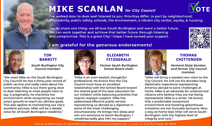
Newspaper columns
Reached readers of local newspapers and showcased endorsements from local officials.

.png)
Reflection
Mike Scanlan's Digital Campaign Success: Boosted Visibility and Funding.
The digital campaign for Mike Scanlan transformed his visibility and set a benchmark for effective political outreach. By leveraging a cohesive branding strategy and a mobile-first website, the team achieved a 97% increase in name recognition and successfully covered 96% of campaign expenses through online donations. The website became a vital hub for engagement, resulting in the recruitment of 28 volunteers and ultimately leading to victory with 55% of the votes in a three-candidate race against more established opponents. These results underscore the power of strategic UX/UI design in political campaigns, demonstrating how targeted digital solutions can mobilize support and drive significant outcomes.
User-Centered Design Drives Campaign Success.
This project exemplifies the impact of user-centered design and agile methodologies in achieving campaign goals. By continuously iterating based on user feedback and analytics, I ensured that the website remained responsive to the information needs of the voters, enhancing engagement, the recruitment of volunteers, and facilitating campaign donations. The dual donation system not only catered to diverse preferences on how to donate but also reinforced campaign transparency, showcasing the importance of adaptability in fundraising efforts. Overall, this campaign illustrates how thoughtful design choices can effectively bridge the gap between candidates and their constituents, fostering a more robust connection that translates into electoral success.
